Carlyle Landing
BRANDING & BUILD-OUT
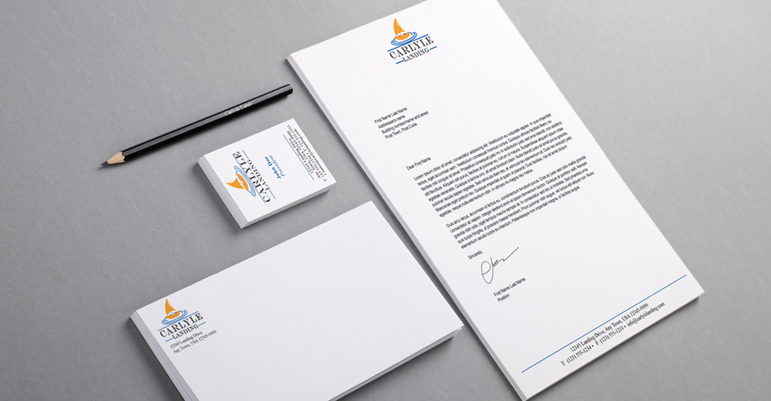
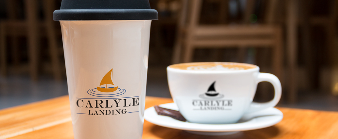
Created for a Homeowners Association who wanted to incorporate the many bodies of water on the property, as well as the feeling of being safe and being “at home”. By experimenting with hand-drawn ideas first, we were able to narrow down our options to one logo design. The logo was improved upon by going through the next phases of digital thumbnails and reviewing which thumbnails the client resonated with the most. By using the client’s final choice of logo design, I was able to create a Corporate Standards Guideline document for them to use going forward. The Style Guide defines standards for size, color, use and placement of the logo. I also worked on print colleteral, including business cards, stationery and other conceptual print collateral and miscellaneous marketing pieces.
Client: Carlyle Landing Homeowner’s Association | Date: April 2013